Shadow Falls Design Analysis: Production to Post Mortem
Preface
This is a look at various aspects of the design of Shadow Falls, a submission to the 2022 Texas Game Jam (TGJ22). This is done primarily for our own benefit as developers to reflect on and clarify lessons that can be learned from the development and reception of the game. I began writing this postmortem in the weeks after the initial 2022 jam, and am returning to finish it in July 2024 as the beginning of my attempt to renew development of Shadow Falls.
Results
I would like to start by looking at how our game was received by fellow jammers, the judges, and additional players in the week following the end of the jam. Simply put, Shadow Falls is the best received game we have created for a jam at time of writing! It was lucky enough to win the Innovative Technology and Best Narrative awards, was given a Judge's Choice award, was runner-up for the Best Visuals award, and placed 3rd in the People's Choice ratings. Awards we missed out on include Best in Show, Best Design, Best Sound, and Best Use of Theme.
These facts, combined with the reactions of people we showcased the game to in-person and virtually, can hopefully provide us a fairly accurate impression of feelings regarding the game. Looking at these outcomes can help to guide our inspection and pinpoint areas of success and potential improvement in the project. My parsing of these various sentiments leads me to conclude the following points:
- Shadow Falls was successful at creating an appealing aesthetic and world.
- Shadow Falls had fairly novel and interesting gameplay mechanics.
- The world design and player instruction of the game could be improved.
- There are elements of the game, such as audio, which did not receive adequate attention.
While these are not the only takeaways we can extract from Shadow Falls' reception, these are a few key points to keep in mind moving forward.
Initial Concept
The given theme for TGJ22 was "Negative Space". Some of our early Ideas for games included such things as: a platformer where you control the color of negative space in the world to solve puzzles, a game where you can only move within shadows and must find ways to navigate to a destination, or a platformer where a black hole sucks away elements of the stage over time to both solve issues and create problems. These ideas were dropped for reasons of being already done, being already done as well, and seeming very difficult to effectively design within the allotted time period, respectively.
Eventually, I pitched the idea of a game where the player has to complete shadow puzzles where they can use any number of various objects in the scene positioned as they desire to achieve their goal, as opposed to the more common variety wherein one predefined object is rotated in a fixed spot to create the desired shadow. This idea exists in my mind as a combination of games like Resident Evil 7 and Gone Home, combining the puzzle sensibilities of the former with the object intimacy and manipulation of the latter.
Beyond that, due to preexisting stylistic inclinations we decided to give the game a calm but spooky aesthetic. With our artist's strength lying primarily in 2D illustration, we wanted to somewhat play to our strengths and populate the 3D game world with 2D elements and comparatively simple 3D models to keep the game's visuals simple and concise.
With these ideas in hand, we had our initial concept and quickly began development!
However, with hindsight it is apparent that some of Shadow Falls' shortcoming were already forming. After inspecting the other top performers in the jam, I am confronted with the fact that the two other tops games, Ralo and Night Shuriken (both of which are great and should be played), are much more constrained, refined games. This allowed them to be much more polished and engaging in the ideas they sought to execute. In comparison, even on a conceptual level there is a lot of potentially distracting fat on the bones of Shadow Falls in the forms of ideas like having a distinct overworld and the various art and programming obligations that entailed.
That is not to say, however, that I think having such "extraneous" elements held the game back. Some of the best parts of the game are just the lovely visuals and small world found in the non-puzzle segments. As such, it seems best to simply internalize that expanding a game beyond its core requirements is as dangerous as it is enticing. Feature creep can often sidetrack a project or draw attention away from key areas. However, it can also push a game towards becoming more than it initially was aspiring to be. Managing the natural evolution and mutation of a game's concept is a skill I need to improve and that I will learn from Shadow Falls.
It is worth noting, however, the things I haven't mentioned here as part of the idea phase. Things such as sound effects, music, and UI are not mentioned here for one simple reason: we didn't mention them then. It is hard to label it coincidence that some of the weakest elements of the game are those not present within the initial design concept discussed here. As such, another lesson I strive to learn from this project is the importance of truly accounting for and planning around all eventualities, offshoots, and ramifications that spring forth from the elements of a project that you initially leap to.
| What went well | What could have gone better | Lessons learned |
| Found an idea that played to team strengths and avoided some weaknesses We had a strong idea of the mood and atmosphere we wanted the game to have Had clear points of inspiration to refer back to | The idea has a lot of excess elements that don't strictly relate to the core gameplay concept Certain key game elements were not initially planned out | Having a tightly-scoped game that considers team capabilities is key Pinpoint mechanics, ideas, or emotions that must be preserved throughout development Consider all the little additional elements branching off from core elements |
Design
There are a couple major elements of design to reflect upon that require their own sub-regions below. However, the postmortem table at the end of this section will include reflections from all such sub-sections.
Puzzle Design
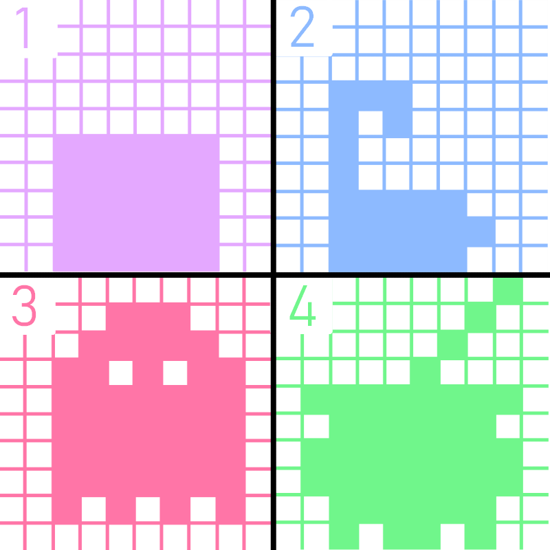
Being the most fleshed out gameplay system and the mechanical meat of the game, it's obviously worth looking at the design of the shadow puzzles. Were they fun? Did they effectively teach the player? Let's find out. A picture of all puzzle designs in order is at the bottom of this section for easy reference.
Puzzle 01
The first puzzle was merely a tutorial for the player, hence its very simple nature. Within this puzzle, our main goal was simply to demonstrate and introduce the puzzle concepts that will fill the game by creating an environment with very few "moving parts" in it for the player to come to grips with. In particular, this puzzle is responsible for introducing the idea of the shadow zones, picking up and moving items, locking items, and completing puzzles.
An attempt to visually communicate a lot of this information was made with the initial shot framing shown below, where the initial placement of the objects potentially shows how the light and shadow works and the wall on which the player should be focusing. However, this was attempt was often not successful and players often fumbled in this first puzzle. Looking at it now, it seems fair to say that several things could have been done to execute on this more effectively. 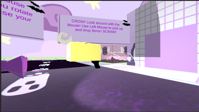
To start, while this shot present the player with many of the key elements they will need to work with to solve puzzles it does not do a great job making clear what those elements are. The shadow crystal blends in to the purple-heavy left side of the screen and, funnily enough, is partially obscured by a visual glitch that I'll dive into later. Following that, the box, while contrasting the scene, is directly in front of a tutorializing crow. Moving beyond the inefficacy of static words to teach a player, this means many played immediately looked past the box and let it become a part of the scenery. Finally, for now, the shadow walls simply don't grab player attention or communicate how they work. Many players failed to understand that the wall was the focus of puzzles or flipped what section of the wall needed to be in shadow. All of these, in my mind, point to a need for more refined, active visual design to help inform and guide players. The light, box, and wall simply are. They have no movement, effects, or visual interesting to get the player questioning. Combine that with an ineffective tutorial method in crows with big, mechanically expository text boxes and it's not much of a question why many players were initially confused.
Puzzles 02 - 04
The subsequent puzzles weren't much better. Puzzles 2 and 3 were meant to introduce the player to using the unique shapes of objects in order to fill in more unusual shapes on the puzzle walls. However, a couple issues formed with this.
Firstly, in my attempt to make the game beatable instead of accidentally impossible I gave the player a plethora of objects for all later puzzles. This meant that the game could be completed in a brute force approach that never required too much thinking or learning. Balance is a difficult thing to calibrate on a tight deadline with a rapidly shifting game, but is is important to consider the ways in which the balance of a game can drastically shift the lessons learned by a player.
Secondly, creating puzzles that required multiple objects stressed the breaking points of the slapped together object and puzzle checking systems. For example, objects such as bottles and canes accentuated the unreliability of object rotation by highlighting object rolling and shifting axes to create a frustrating experience for players. Beyond that, requiring the player to cram multiple objects around a single light source drew attention to the rampant object clipping and wonky physics underpinning the system. In all, this failure helps to reinforce the need to a reliable, easily readable mechanics to form a comfortable bedrock for player action in a game.
Finally, some elements of the puzzle system were simply needlessly confusing or broken. Did allowing the player to move the shadow crystal meaningfully add anything to this version of the game? No, not really. Did it lead to some players becoming confused or breaking the game? Why yes, it did. If a mechanic adds almost nothing to a game and simply adds another point of failure, perhaps don't keep it in the game. On the note of points of failure, it was also a recurring issue that players were very capable of dropping puzzle objects out of the world and locking the game. We added in an emergency scene reload to alleviate this issue, but that does nothing to solve the underlying issue. Removing ways for the player to complete break the game or designing mechanics with constraints that improve game flow and reliability must be a constant focus as the game forms.
Overall
The puzzles en masse serve to reinforce many of the strengths and weaknesses I see within Shadow Falls. I think the base idea is interesting and something players are capable of understanding and having fun with. However, that possibility was majorly handicapped by unaddressed issues of design and implementation that prevented many from getting to explore and find the fun of the puzzle system.
World Design
One of our main goals when designing the overworld layout of the game was to have several distinct zones with their own unique assets and puzzles. We like to think we were relatively effective in this given our tight asset restrictions, as we managed to create a compact world that contained the following zones, each of which has its own elements and NPC:
- A residential area lined with homes
- A commercial area filled with shops
- A forest full of trees and bushes
- A lake alive with frogs and water
As such, we are relatively happy with the world design of the game on a purely presentational level.
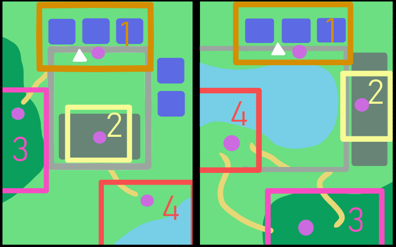
The world design of Shadow Falls (shown roughly in the left half of the picture below) in a gameplay sense is, to not put too fine a point on it, a little bad. Pretty much the only effective aspect of this world design is that most players did the first puzzle first, which is good as that puzzle contains almost all of the tutorializing for the puzzle segments of the game (a design choice that is itself questionable). However, this is accomplished by simply placing the player right by that puzzle when they start the game.
Beyond that, the layout frequently meant players missed puzzles or skipped to the harder puzzles right away. This is, in hindsight, no fault of the players as the map we created looks almost as if it was designed to lead players to do puzzles in reverse order. The symmetrical nature of the roads of the map immediately mean we only have a 50/50 chance of correctly guessing which way the player has gone. Beyond that, the second intended puzzle was far enough back from the main road that many players would fail to see it as they followed the road. This fact, combined with the visibility and obviousness of the two paths diverting from the main road to the two final puzzles, meant that almost all players we showed the game to did the hardest puzzles right after the tutorial. This resulted in some players spending a long time struggling with more complex puzzles using controls and mechanics they were still new to.
As such, it seems fairly obvious that a theoretical redesign of the world layout that is more conducive to a pleasant player experience is a good exercise to conduct.
To begin, I think its fairly uncontroversial to keep the player starting next to the tutorial puzzle. That can stay. Immediately after that, however, is where the changes begin. I would argue for the removal of one side of the square forming the roads of the town. This asymmetrical design is, in my mind, both more interesting and allows for more certainty regarding the player's movement as they leave the tutorial. It reduces the openness of the world to some degree, but the very start of the game is not the time to grant the player full control of their gameplay destiny.
Following that, the second puzzle/zone has now been moved to take the place of some previously present but vestigial houses. This relocation, combined with the puzzles placement closer to the main road, should allow more players to find this puzzle as the explore from the starting area.
As the player returns to the main road following the second zone, we'll keep the path leading off the upcoming corner to a puzzle as this seemed fairly effective and intuitive for players to understand and follow. However, we'll obviously shuffle puzzle placement to have the third intended puzzle at this location.
Upon completion of that puzzle, we'll account for the two most likely actions of the player at this point: returning to the main road using the path they came on or continuing deeper into the woods. If the player returns to the main road, they will continue until finding another offshoot that takes them to the final puzzle. If they remained in the woods, however, they will now find a new path that accomplishes the same thing of guiding the player to their ultimate puzzle.
The final puzzle, and the accompanying lake, has been moved to be at the bottom of the center of the town. This allows the lake to serve as another guiding force for the player as even if they venture from the road to explore the waterfront they will still be roughly following the intended route through the game.
These changes, shown in the right half of Figure 2, would improve the intended play sequence of the game from a nonsensical zigzag to a far more intuitive and player-friendly circuit.
Figure Guide:
- White Triangle: Player staring position
- Purple Circles: Puzzle locations
- Colored Boxes: World Regions
- Orange: Neighborhood
- Yellow: Shops
- Magenta: Woods
- Red: Lake
- Colored Numbers: Intended Puzzle Order
| What went well | What could have gone better | Lessons learned |
| Players were given openness and options in exploration and puzzling The game world was interesting and fun to explore | We failed to properly teach or leverage the openness of the gameplay systems The world design could have been refined to better guide players | Pay great attention to ways to ensure players can quickly read and learn gameplay systems Consider world layouts that both restrict and encourage player freedom in ways that provide players a positive and intuitive experience |
Technology
Technologically, Shadow Falls is interesting. On one hand, we got the Innovative Tech award so we must have been doing something compelling. On the other hand, a lot of the game barely works and what does work isn't always player readable. I'd argue there are a few key factors we can attribute this instability to beyond simply being a jam game.
The fundamental idea of Shadow Falls is having open-ended shadow puzzles with multiple, non-determined objects. That idea has a lot of potential for player expression and emergent gameplay, however it also has a lot of implementation questions and technical uncertainty. How do you track puzzle completion? How does the player manipulate the objects they use? How do you create the puzzles to be solved? These are all very open-ended questions that we answered one way or another during initial development.
The fundamental core question among those is how do you track and quantify the player's shadows to evaluate their puzzle completion. The way we tackled this was, as many game devs tell you to do, lying. The shadows themselves are nothing. What truly mattered what checking if a line could be drawn between the puzzle light and puzzle surface without any other object being in the way. While we could have tackled this any number of ways, this was the way I felt most confident implementing over a single evening.
While this, for the most part, worked perfectly fine for this mini game it did lead to some issues on the development side of things. To start, checking against a set of predefined points meant that I, a developed, had to define all those points. They're only "pre" to the player. I created a somewhat streamlined workflow for this by the end of the jam, but it still involved a lot of manually-typed values that leave room for operator error. On the dev side of things, there is definitely a tools gap that could stand to be filled. From this, I stand to learn both the importance of custom-made tools and the necessity to acquire the ability to create custom tools. I suppose one can't truly appreciate tools developers until being confronted with their absence.
Beyond ease of development, however, I am uncertain of the scalability of my particular approach. It worked in a very rough-grain jam setting but could it be refined to have more precise puzzle detection without impacting game performance? It is worth researching to more confidently know I am utilizing an efficient, flexible approach to this particular problem.
Moving beyond the puzzle mechanics, there is an entire other segment of game waiting to be dissected. The overworld presented some technical difficulties in that it introduced the need for more state than the game would have required otherwise. Part way through development I wanted to add a distinct ending screen and the ability for aspects of the overworld to chance based upon completing puzzles. This now meant tracking puzzle completion and having a system to translate that into changes to game objects in the overworld. This is, of course, not a Herculean task. It is, however, not a wise task to start undertaking after many other parts of the game have already been coming together without that requirement in mind.
On such a short time budget, I wound up avoiding state as much as possible and created an extremely unreliable and finicky system that is certainly not extendable to a larger game. I am not advocating against raw jank in the name of getting a jam done, however I am actively acknowledging the aspects of the code architecture that require a complete overhaul. Furthermore, even a fairly standard, mundane system is a hurdle to overcome in development if it was not adequately planned for.
| What went well | What could have gone better | Lessons learned |
| Effectively demonstrated the potential of the gameplay mechanics Included two distinct gameplay modes that are distinct and (mostly) functional | Some internal systems were clunky and slowed content creation and testing State was largely avoided due to issues with its storage and handling | Create tools to accelerate workflows that are integral to development Adapting existing systems for new mechanics and ideas is a difficult, strenuous process |
Visuals
I truly adore a lot of the illustration work that went into Shadow Falls. Many elements of the world are charming, unique, and just beautiful. However, there are parts of the visual presentation that failed to live up to that high standard and ways in which the visual presentation of the game undercut some of its design goals.
Most of the 2D work is cohesive and focused as it all came from the same artist. With that consistency, the world was able to be well-defined and enjoyable to explore despite its many constraints. It is humbling as a programmer to fully consider the ways in which effective, well-executed art assets can compensate for a lack of technical complexity.
To shift to areas to improve: the 3D models for the puzzle objects. I did all of them in a couple hours with limited Blender experience. They are obviously not great and could stand for drastic improvement. However, despite the limitation on the models themselves they also do not mesh (ha) well with other aspects of the game in terms of things like lighting, texture, colors, etc.
Lighting as a whole was rather weak for a game all about puzzles with light and shadows. This is a consequence of simple unfamiliarity with more advanced aspects of the lighting system used and an indicator of a key area of research when revisiting the project. Beyond that, shaders are a key element in defining how models in your game react to lighting and something which was wholly ignored during the initial development of the game. Greater control over shadowing and lighting would have gone a long way in bridging the gap between the 2D and 3D elements of the game.
| What went well | What could have gone better | Lessons learned |
| Many of sprites and textures for the game were excellent There is a cohesive sense of style to most 2D elements of the game | Lighting and environmental effects could have been better utilized 2D and 3D elements could have been more seamlessly combined 3D models could have been more interesting and better executed | Atmosphere and tone benefit from many different elements Our team has a lot of room for improvement in regards to 3D modelling and animation Shaders are integral for greater stylistic control over 3D assets |
Miscellaneous
There are a number of components in Shadow Falls that deserve evaluation for one reason or another but are not quite substantive enough to obtain an entire section. We can simply go through them in relatively quick succession here.
Audio
The audio of the game was largely ignored. The ambiance of the game is almost entirely driven by the music, with little else adding to the soundscape. This only served to make the world feel smaller and less alive that it would have with a deeper soundscape. Additionally, the music is AI-generated. This was incentivized by the jam as a diversifier, but is nonetheless something I now regret. When actually developing a sound for the game moving forward, consider sounds and notes that reinforce the emotions we want players to feel. Audio is a massive part of tone-setting for games that we largely ignored in the initial jam
Characters
There are very few characters in the game and those that are present have very little to say. The occupants of a game world are a key factor in making it interesting to explore and navigate and as such NPCs much be given greater focus in a more fleshed out project. However, it is important to create NPC behaviors and interactions that feed into other aspects of the game. If the player is helping NPCs as the main game mechanic, how can we make NPCs the player wants to help?
Story
While not atypical for a jam game, the story is serviceable at best. However, an area in need of even greater improvement than the "main" story of Shadow Falls is the side stories of the world and its characters. Players liked exploring the world and we should have done more to give them narrative drives to do so. Little stories and pieces of mystery around the world would have done a lot to keep players interested and engaged.
| What went well | What could have gone better | Lessons learned |
| The AI made some OK chill music Story at least introduced the main game concept | The soundscape of the game was far too barren The characters lacked any depth and didn't encourage the player to help them The world lacked additional story elements to make exploration more engaging | Develop a deep, tonally-consistent soundscape for your game Create engaging characters that fit the style of the game they are in In a game about exploring and solving puzzles, sprinkle bits of narrative around the world |
Conclusion
Shadow Falls was a game with many strengths and many flaws. It was a hastily made work of passion from a team of two, and I learned about every stage of game creation from making it. While it performed well within the jam, it could have performed better and looking at it next the the games it was competing against serves to reinforce many of the lessons I have outlined above. I have spent the last 2 years thinking of this game fairly regularly. I've learned from what we already made and look forward to leveraging those into creating a version of this game that takes those lessons to become what Shadow Falls deserves to be.
